The Premise
The Royal Society of Arts (The RSA) is an organization founded on “enriching society through ideas and action.” Since 1924, they have organized the Student Design Awards challenging young people to rethink the present to create the future. I participated in the 2016/2017 RSA Design Competition by responding to their circular economy challenge. It asked that the current linear model for fast-moving-consumer-goods (FMCG's) of create-use-dispose be rebuilt to go from earth to user to earth.
To address this problem, I teamed up with Remily Middaugh, Connor Ruest, Christian Smitas and Adam Linka to create Bold: The Better Bottle of shampoo, body wash and conditioner.

Inception
Our design process began with a brainstorming session regarding our pet peeves with current FMCG's; these pet peeves included everything from the use of styrofoam for fast food containers to wasteful deodorant bottles. Once our ideas were written out, we noticed they all circled around one common issue: packaging.

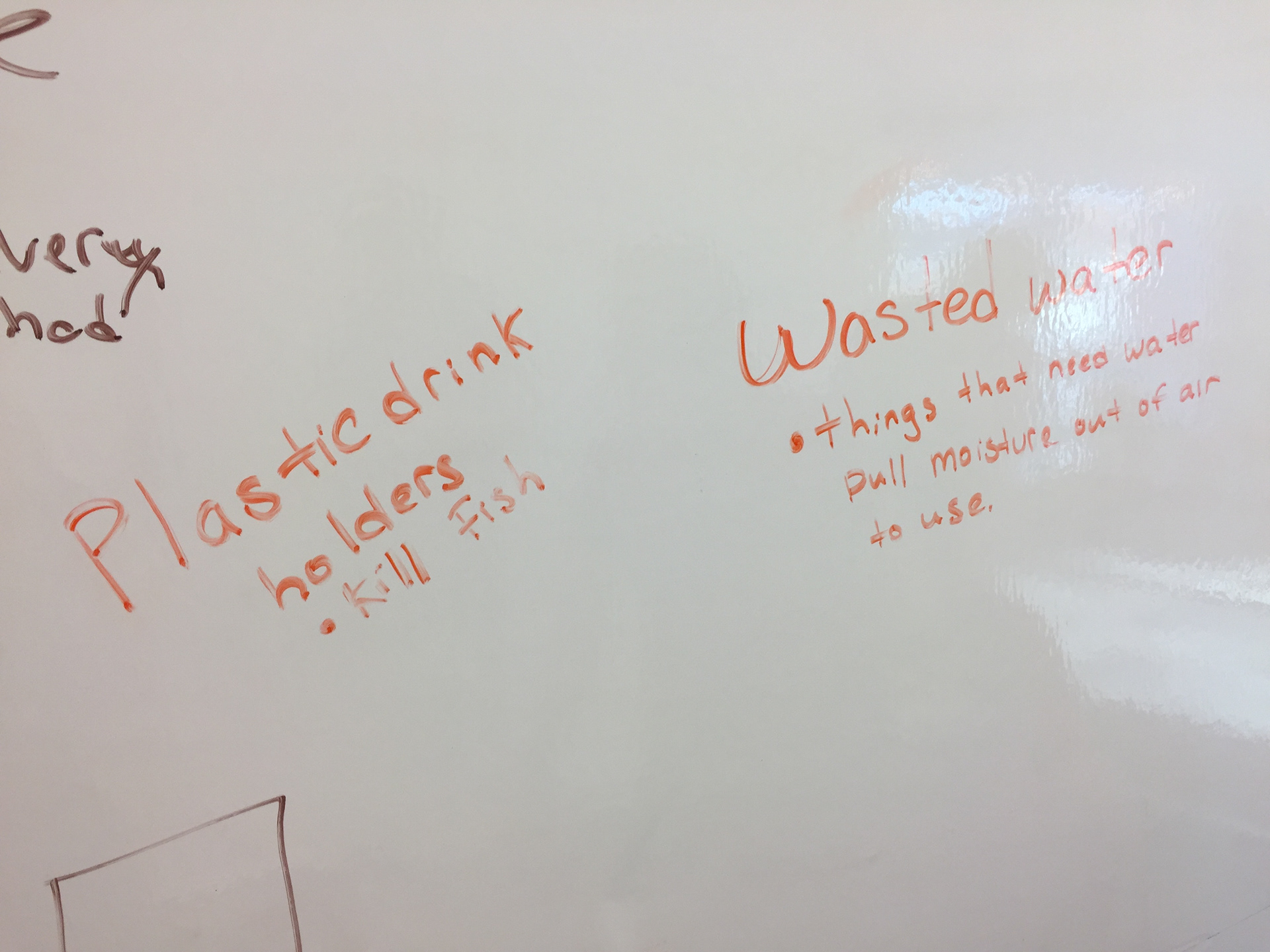


Having looked at all these packaging issues, we knew we had to innovate in this space. This realization lead me to the idea of a biodegradable shampoo bottle that would have a seed packaged alongside it. This would allow a customer to use the shampoo bottle as a flowering pot when they were done with it and, if they desired, plant the entire bottle into the ground. This bottle would be paired with a marketing campaign to educate consumers on wasteful packaging and the circular economy.

This is the creative brief for our original design idea. I find it fascinating to look back on this to see how much the project evolved throughout the design process.
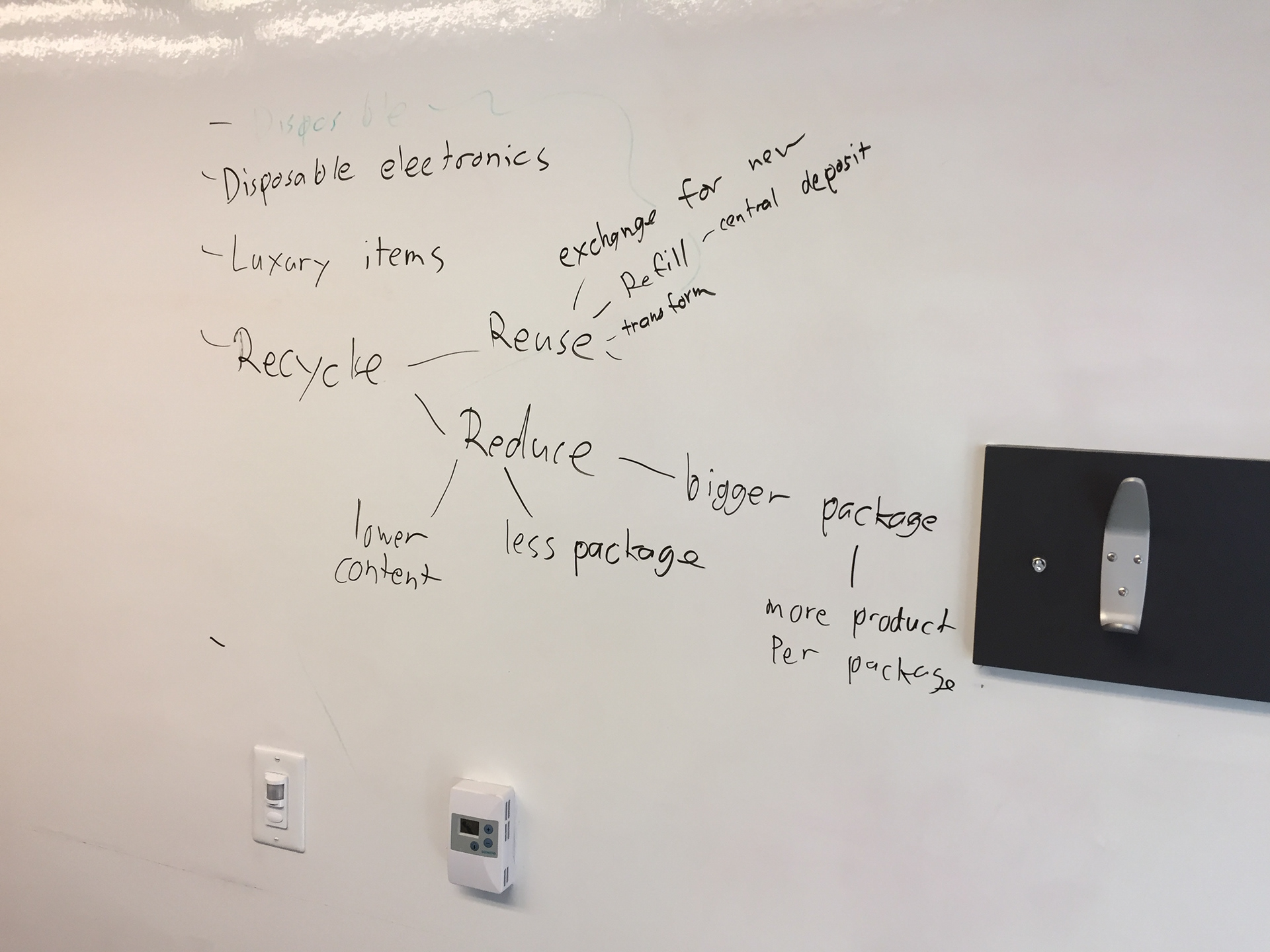
The Problem Redefined
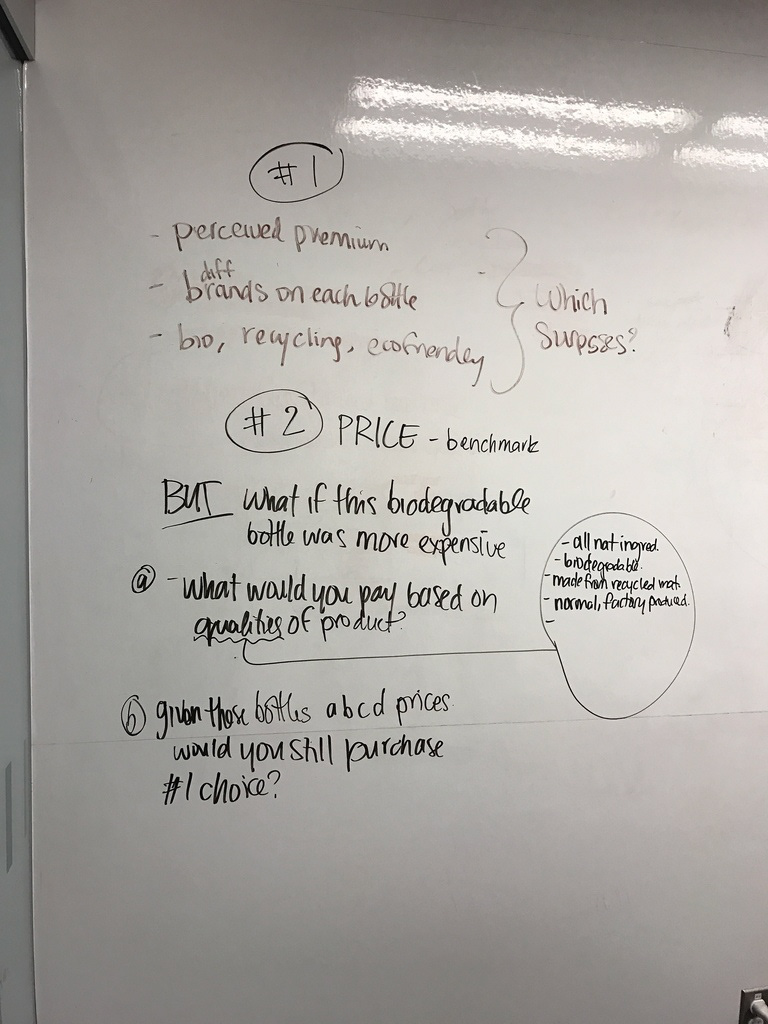
After spending a few days on this idea, we found ourselves feeling uninspired. We were passionate about the problem of wasteful packaging but worried our idea was more a gimmick than a real solution. After hours of frustration, it was recommended to us that we redefine our problem. To do this, I lead a problem tree exercise aimed at getting to the core of our packaging pet peeves. After collectively unpacking these pet peeves, I noticed a correlation between package design and consumer preferences. It looked as though certain packaging was designed simply to appeal to what these manufacturers thought consumers desired, and not with the environment or supply chain efficiency in mind.


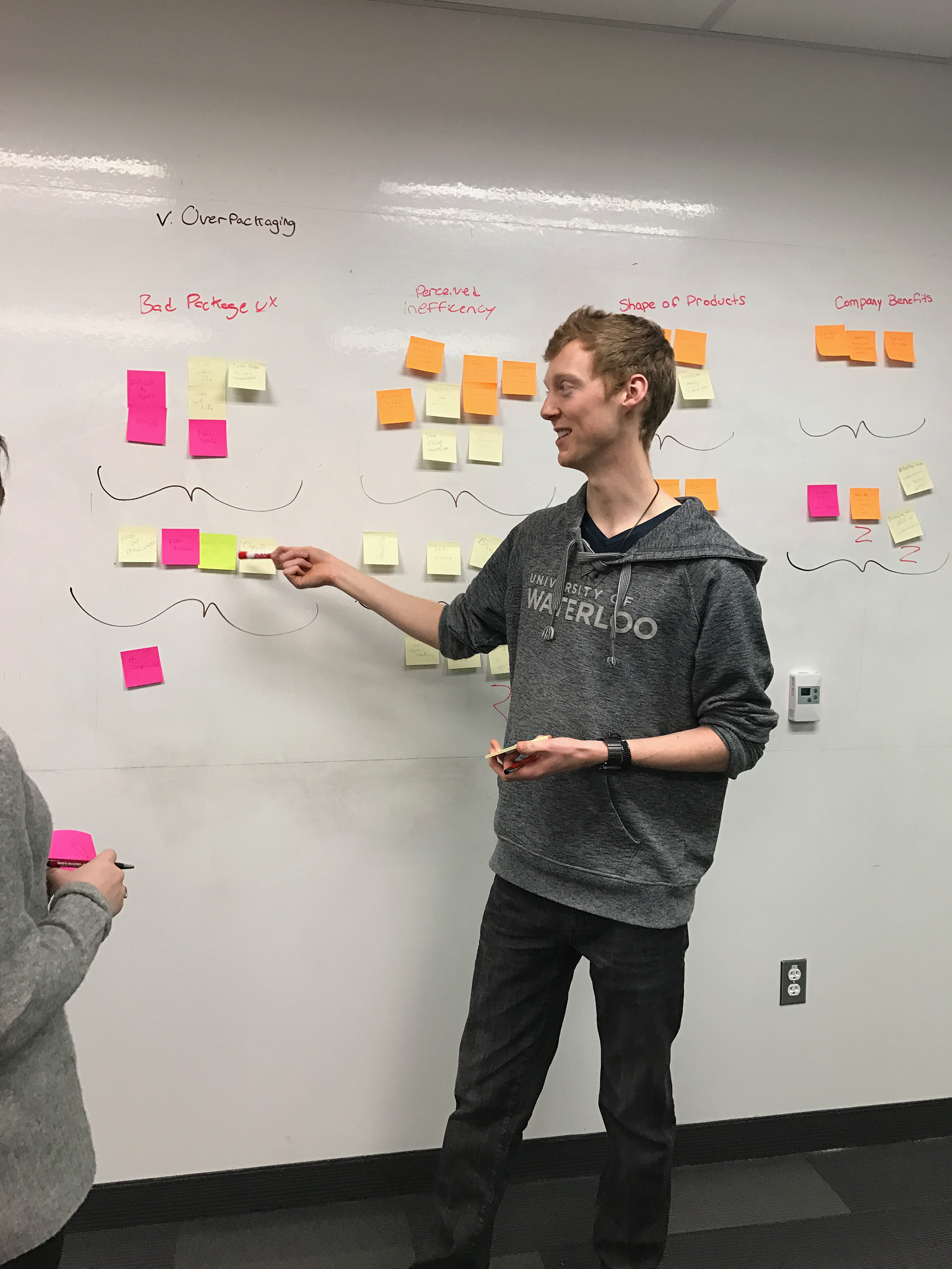
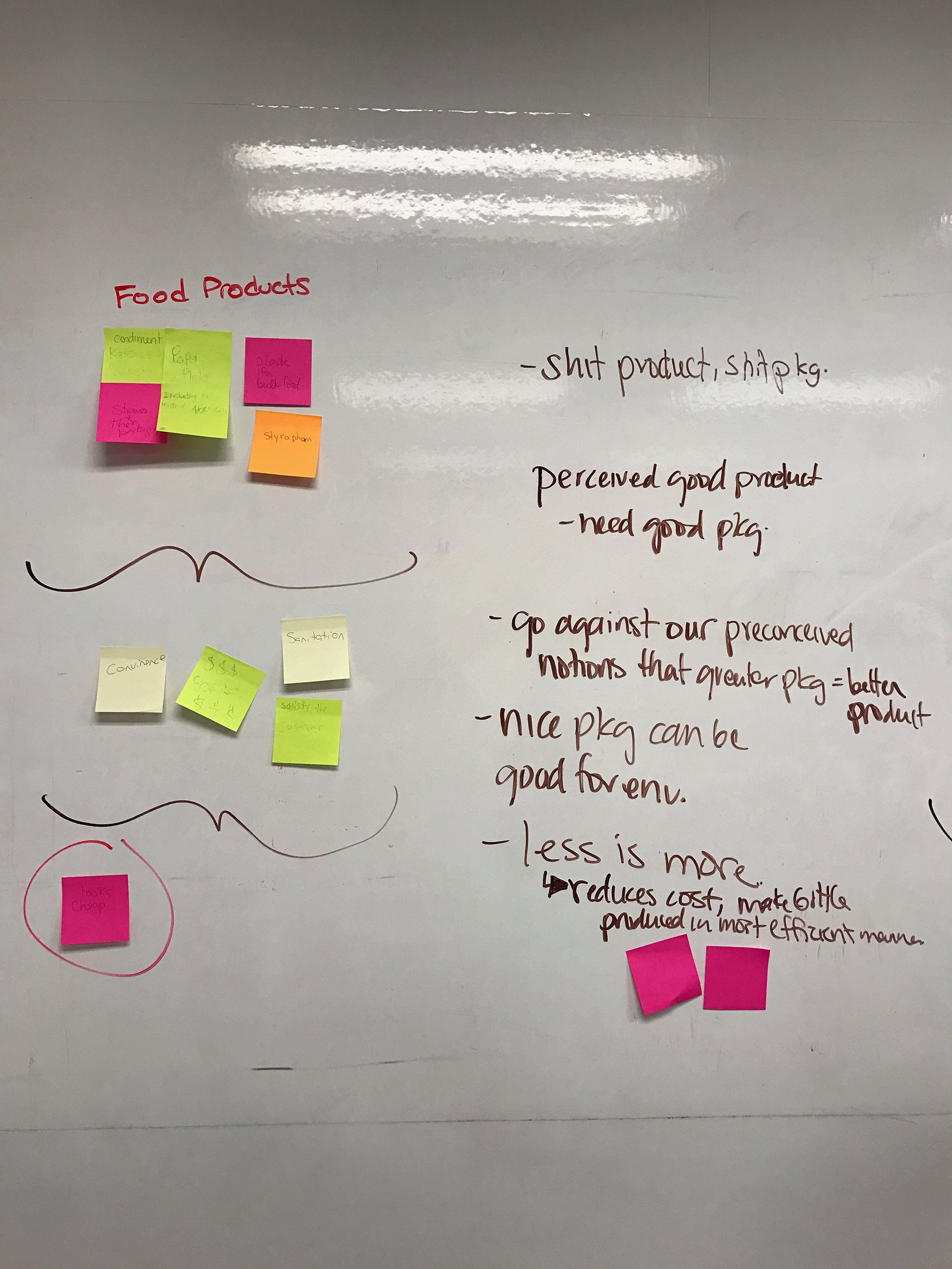
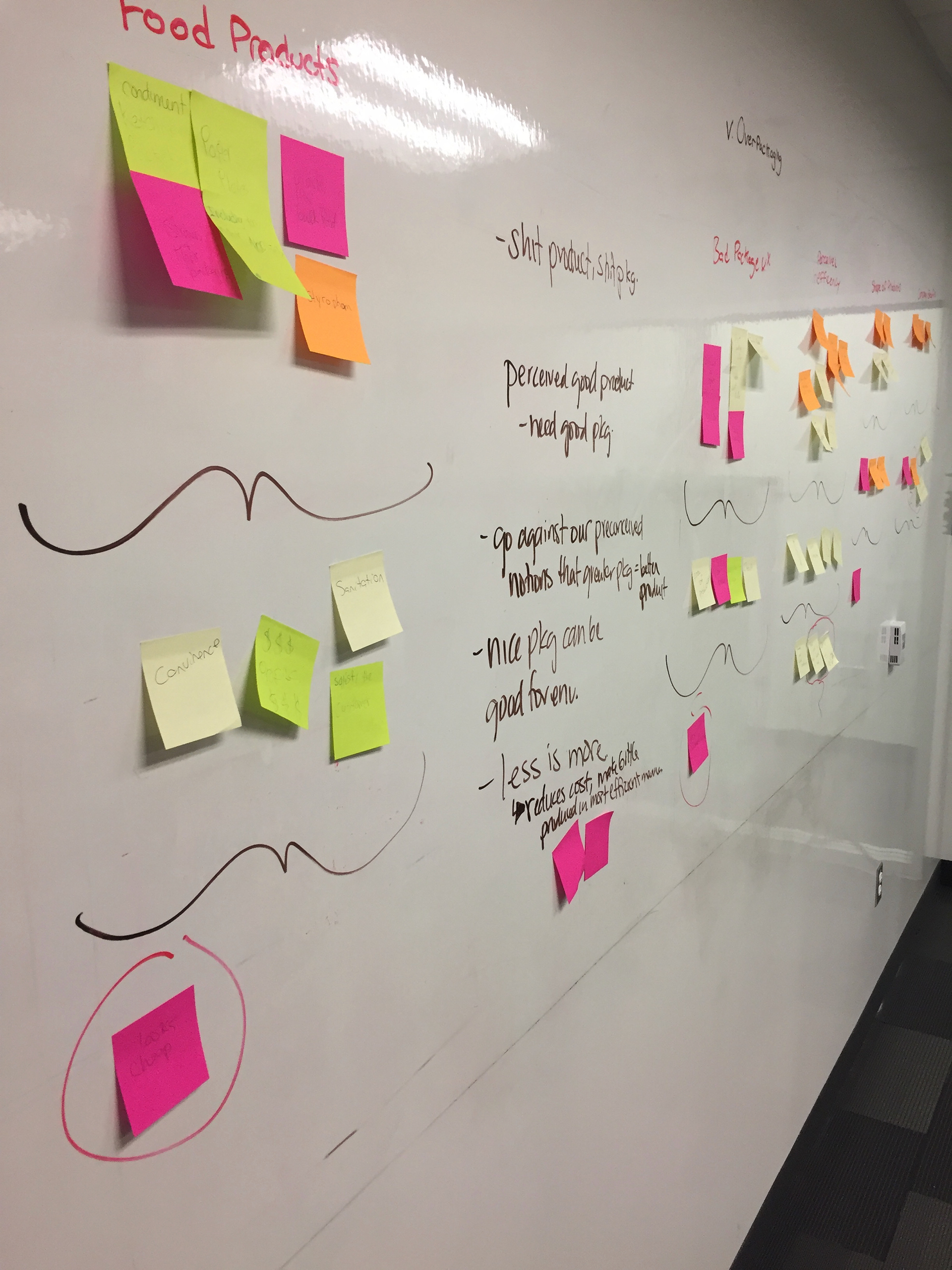
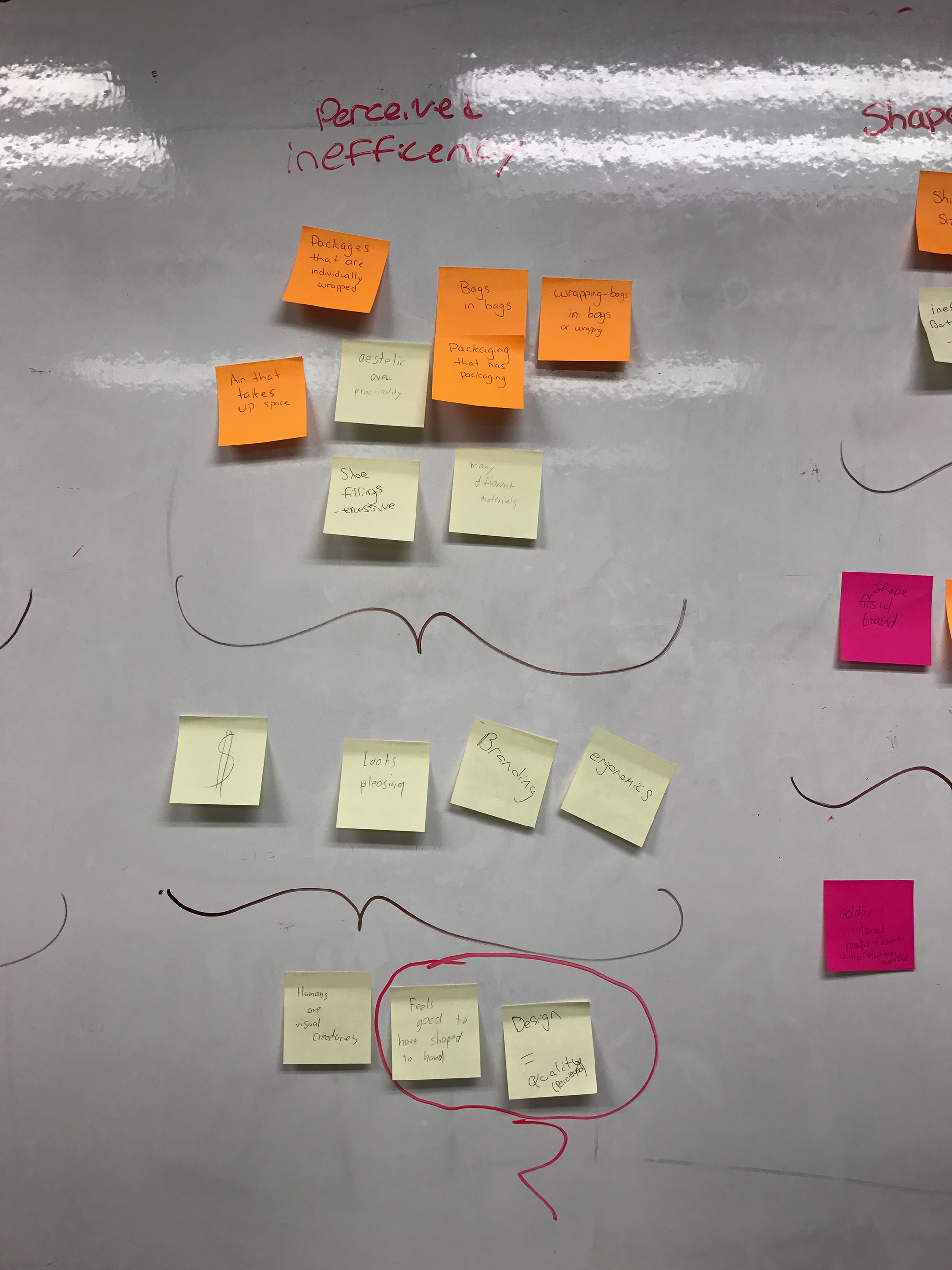
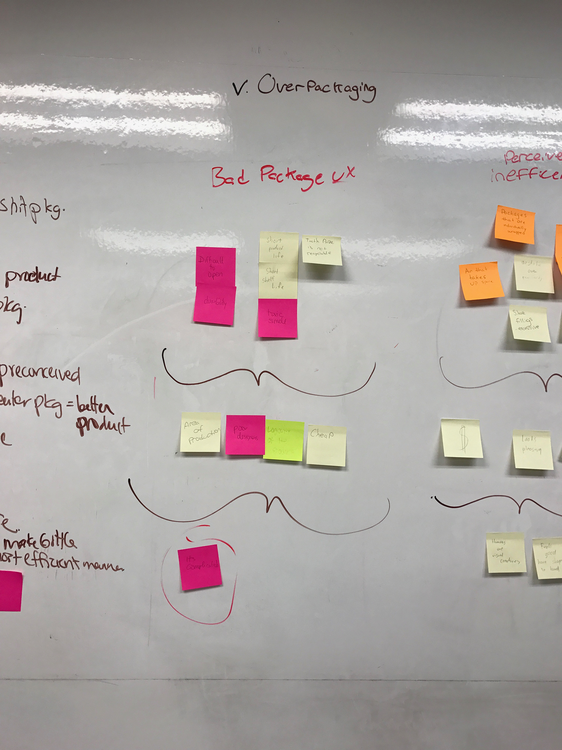
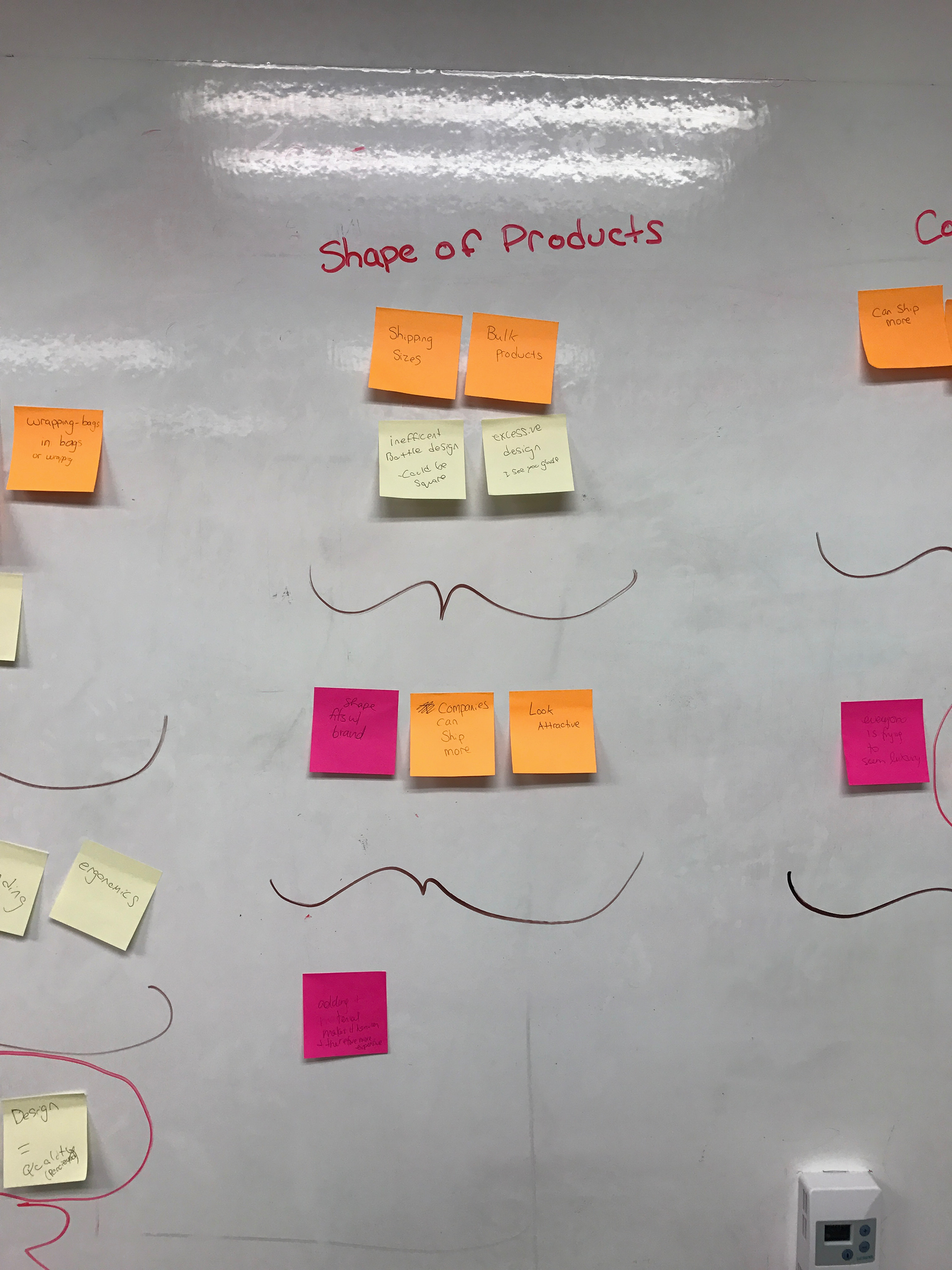
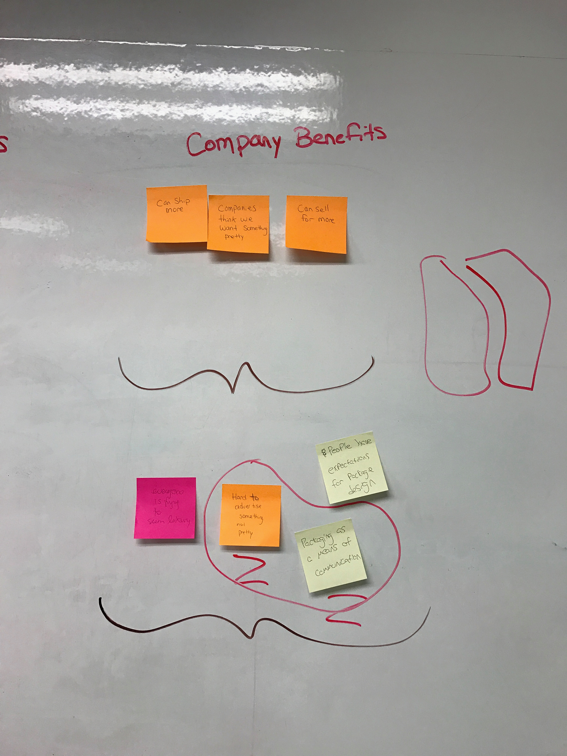
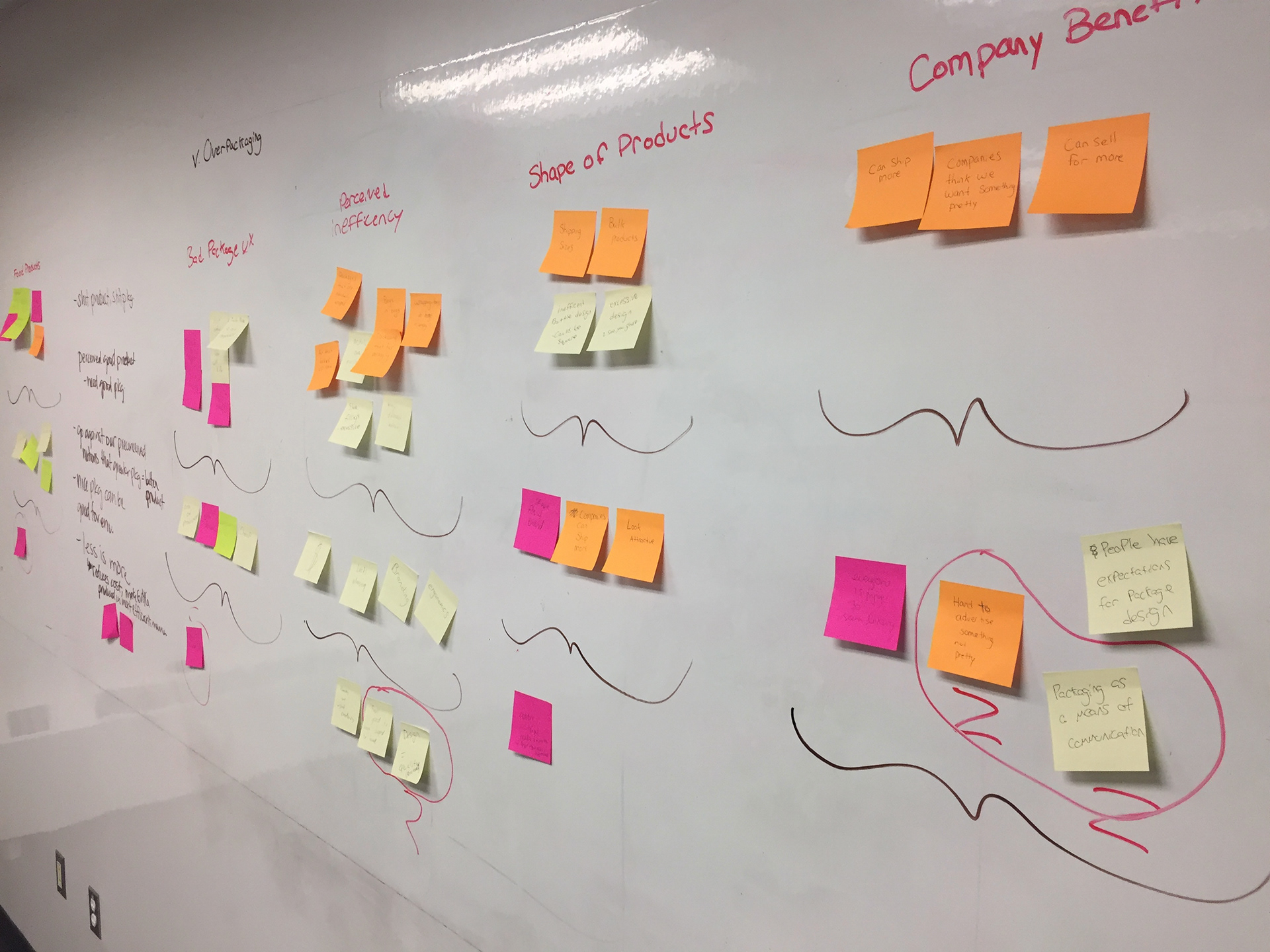
While this seems like a simple conclusion, it lead me to ask, ‘what if we could build an environmentally space efficient bottle that still appealed to consumers?’ This question was a challenge, and one that we knew needed a bold solution.
The Process
The next step in our process was to validate our hypothesis about the inefficiency of current packaging designs. To do this, we took the dimensions of existing shampoo bottles and created a rectangular prism (the shape best for shipping) with the same dimensions. To our surprise, the first bottle we tested was around 60% space inefficient, meaning 60% more shampoo could fit into the same dimensions the bottle was currently occupying within a box. We knew we were onto something.
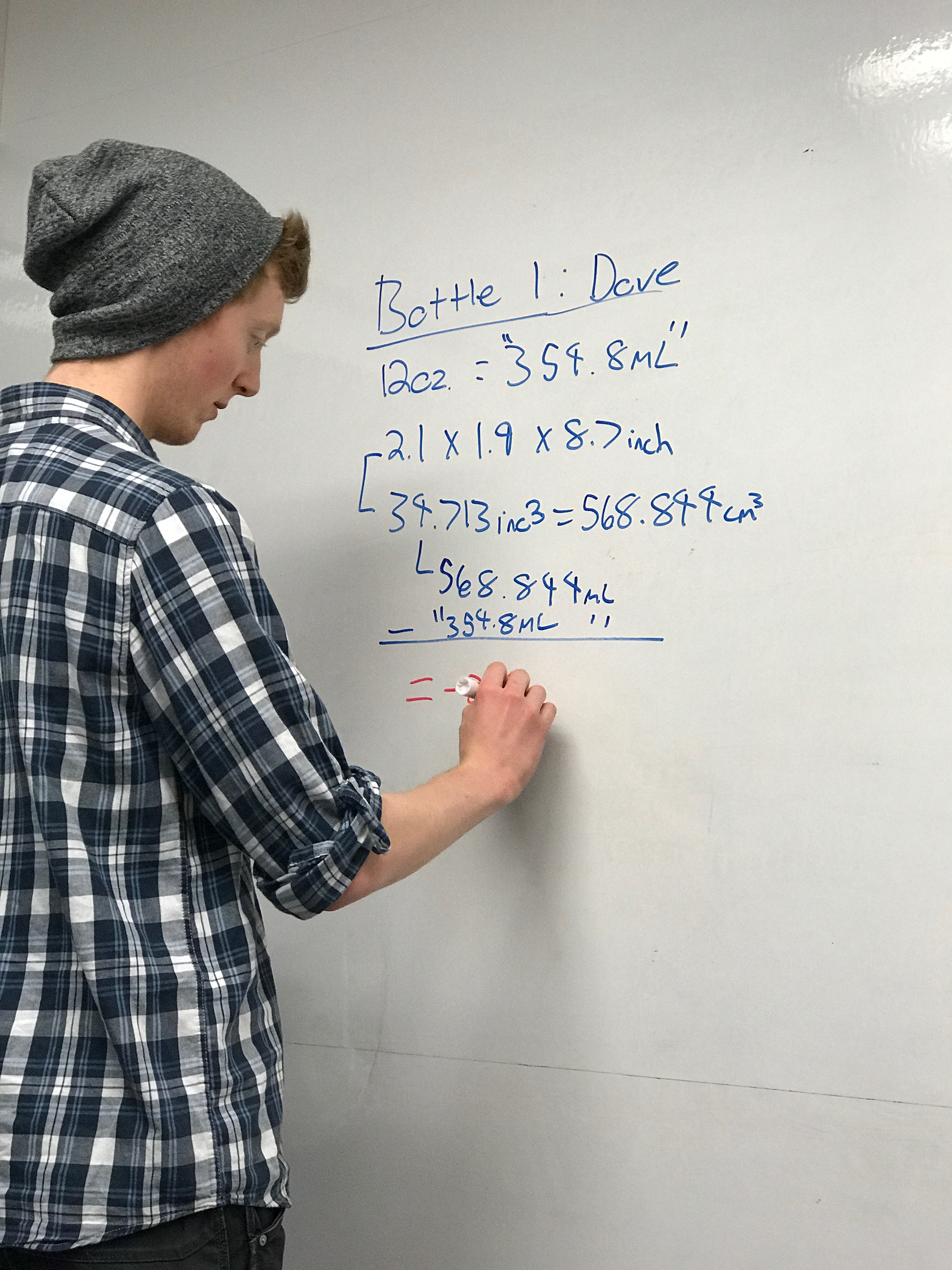

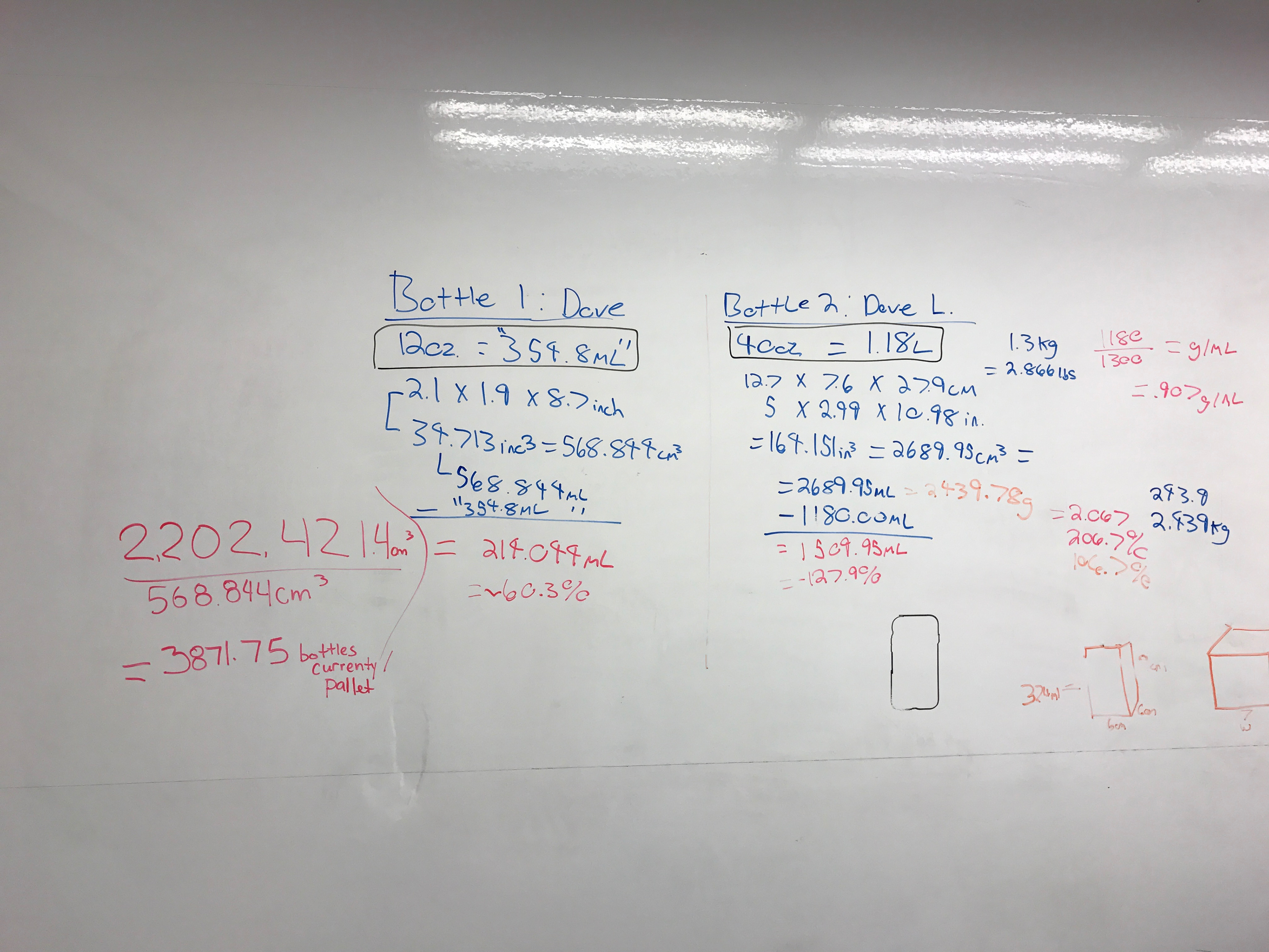


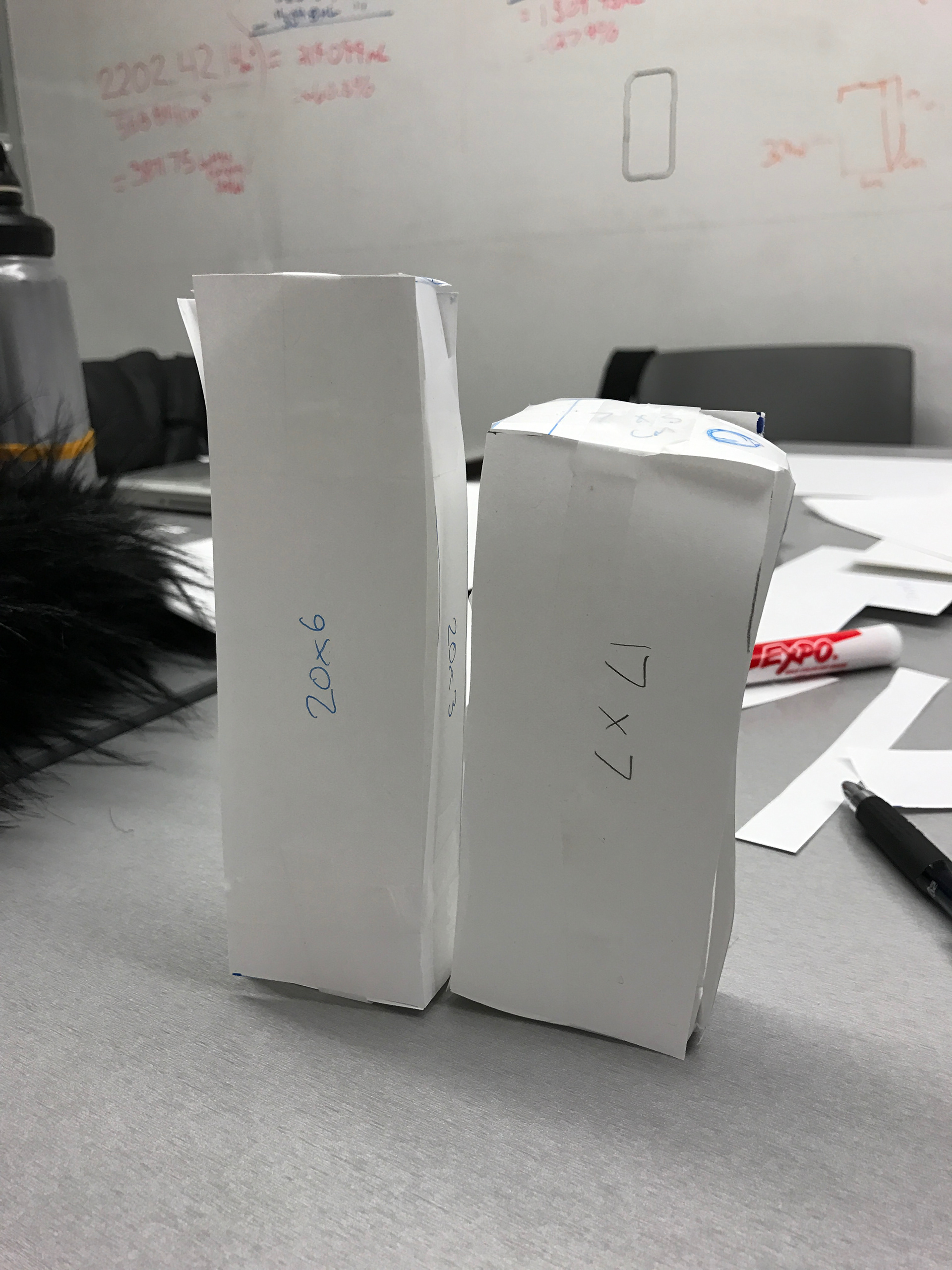

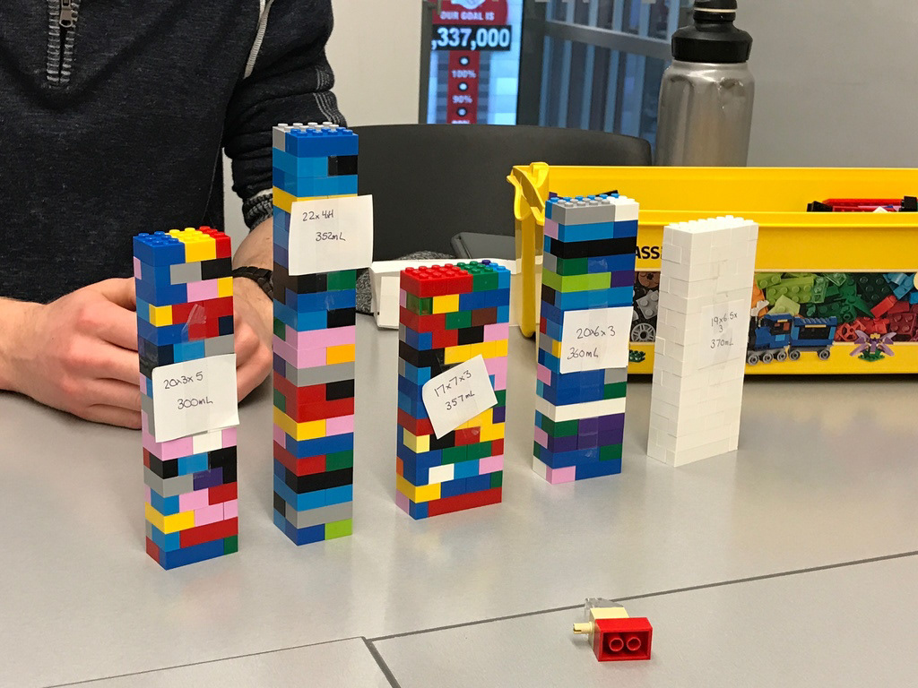
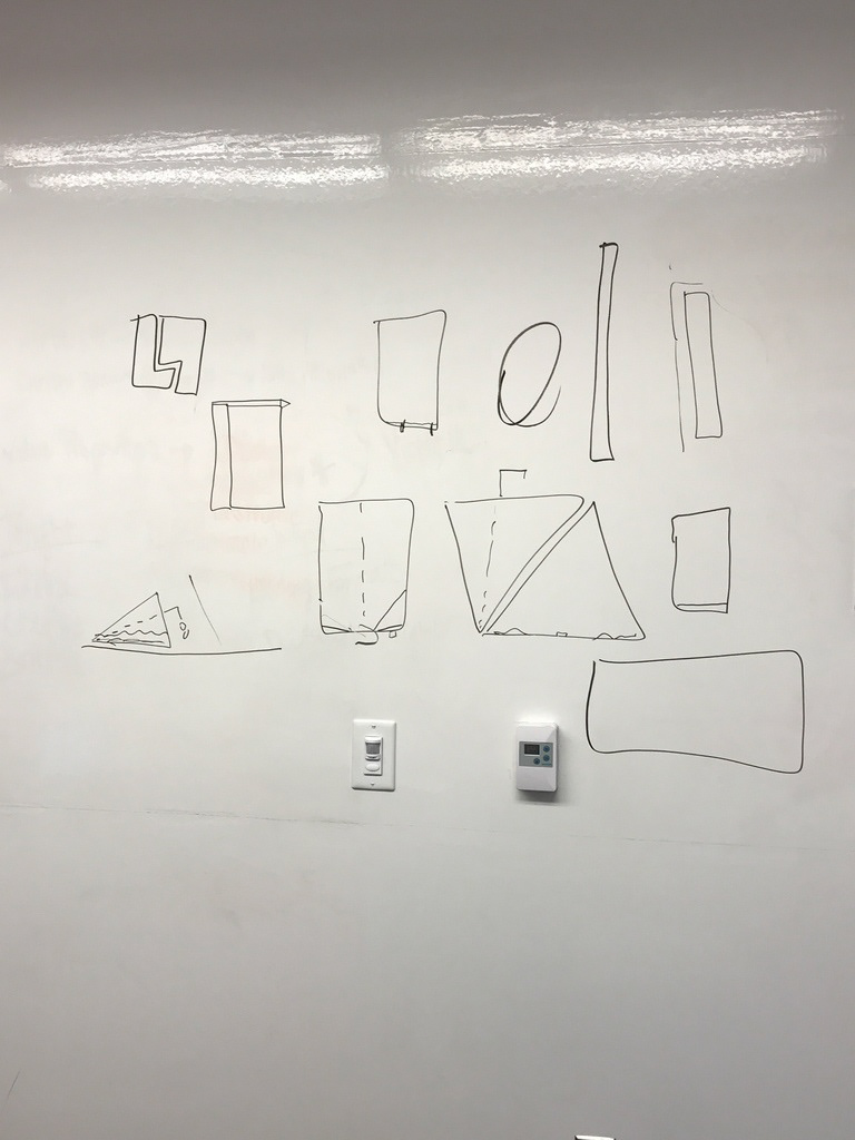
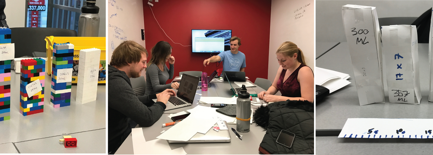
Further research showed us that most smaller format shampoo bottles were between 350-450mL in volume, so we created several paper prototypes with varying dimensions that met these volume requirements. From there, I suggested we raise the fidelity of the prototypes to plastic, so we constructed our favoured five dimensions in lego.
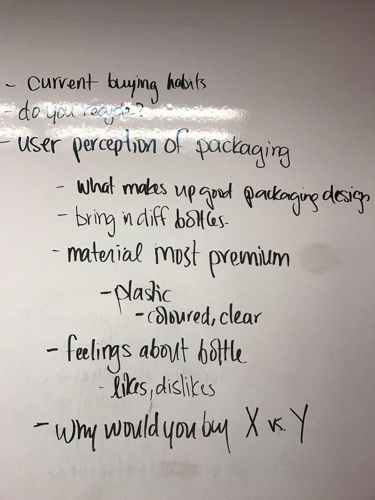
User Validation
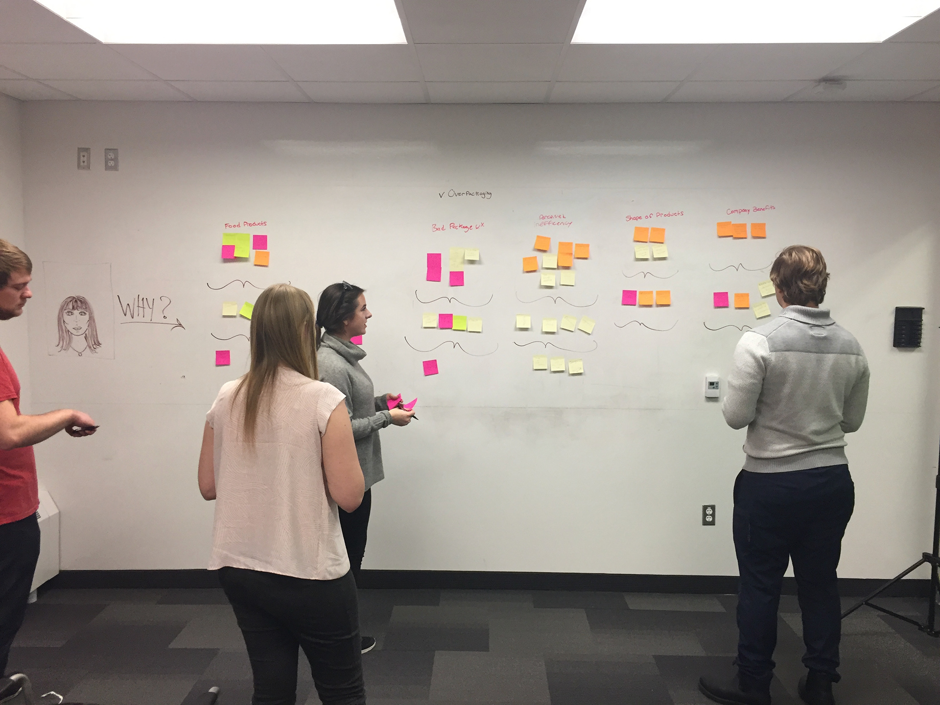
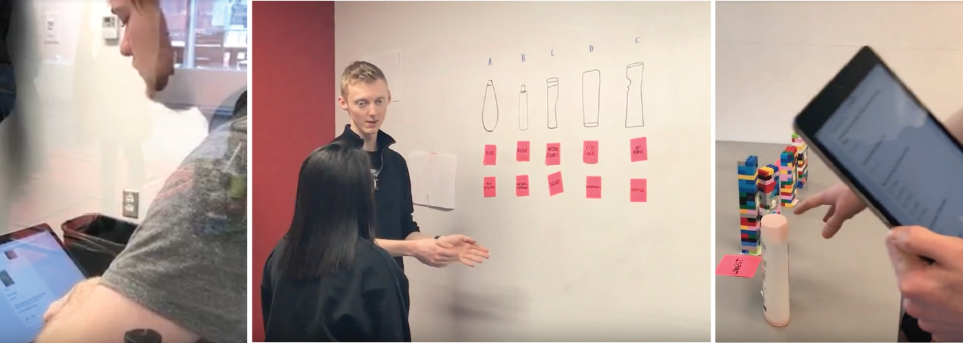
Bold’s success would rely on more than just it’s space efficiency; to be a true success, Bold would ultimately have to sell. To do this, Bold would have to stand out on a shelf, project a sense of value to consumers when side by side a bottle 60% larger, fit ergonomically into the hands of users and store a market average quantity of product. To ensure Bold’s success in these areas, a variety of user tests were conducted to see how customers would perceive Bold’s simplistic rectangular design, and which dimensions would be the most favoured. From these tests, we identified a number of refinements that had to be made to the cap design, edges and dimensions. The cumulative result of these refinements is the final version of Bold.
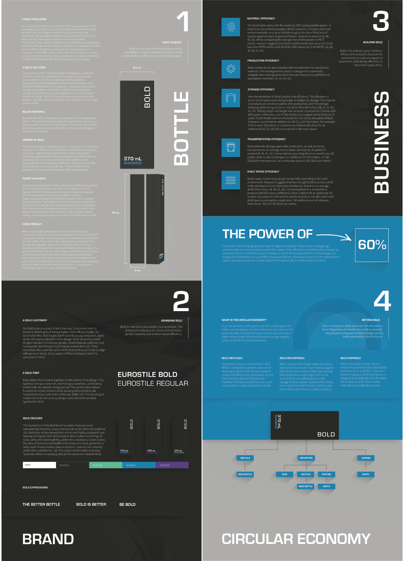
A Bold Solution
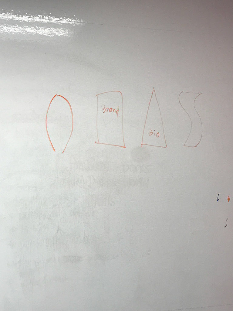
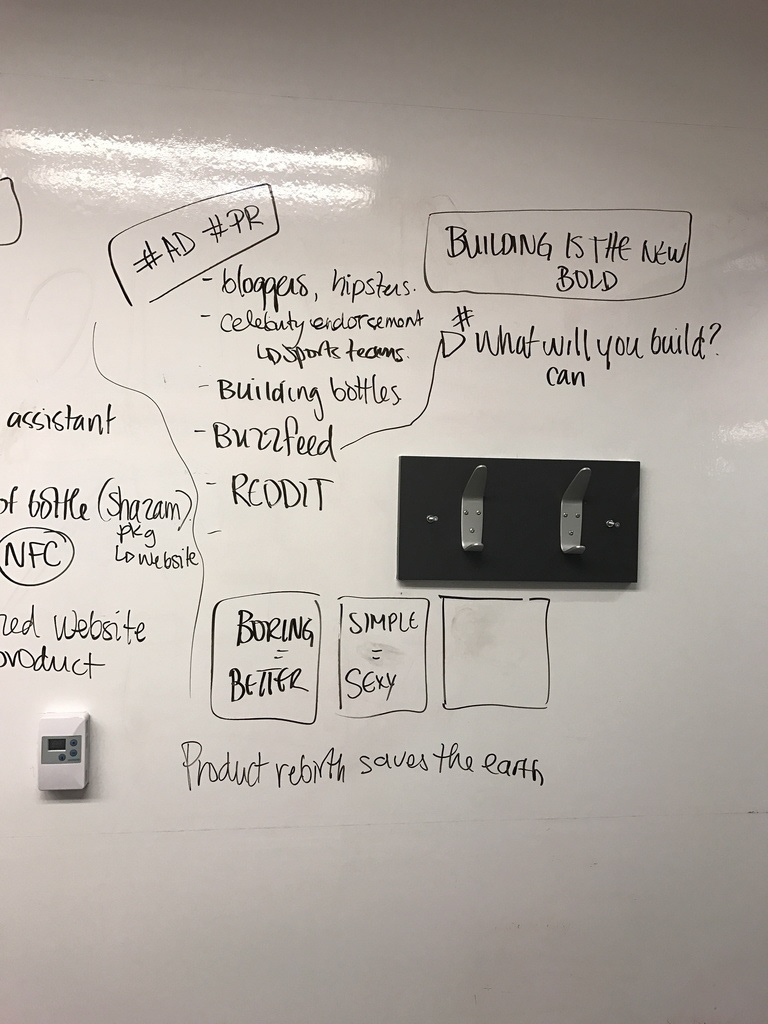
Up until the final stages of the project, Bold was a bottle and a marketing campaign targeting green consumers. As the project came to a close however, I suggested that we drop the legacy idea of the marketing campaign and create a Bold brand instead. During our user testing, we discovered that a younger Millennial audience actually preferred simplistic packaging design over conventional ones. For this reason, Bold’s brand is targeted to this younger demographic. The Bold brand is sexy, gender neutral, simplistic and forward thinking. Each attribute of Bold is selected specifically to appeal to this demographic, and will ensure that Bold’s simple design is used as an advantage in making it a market success. This finalized the Bold solution as a bottle and a brand.

The Submission
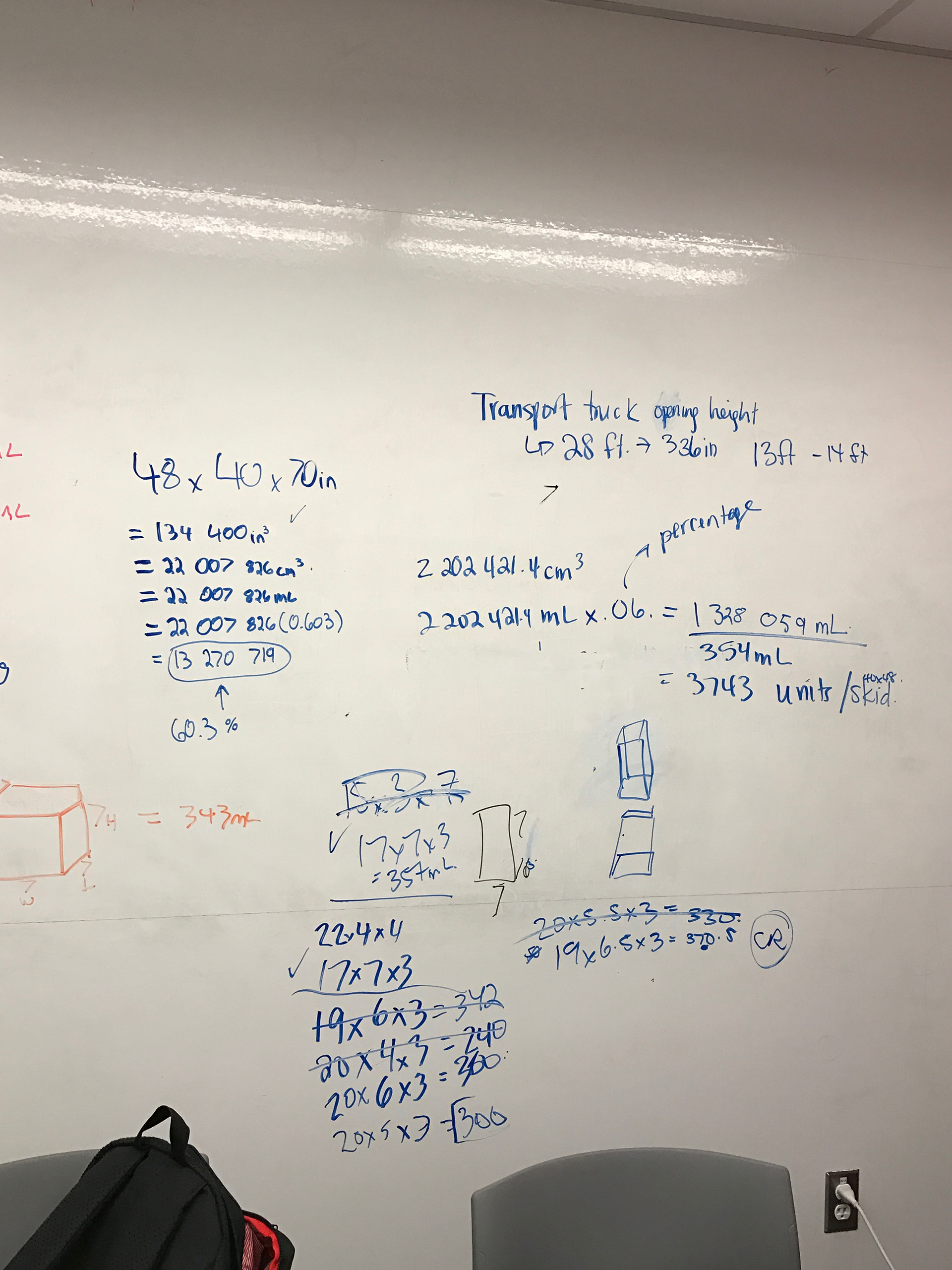
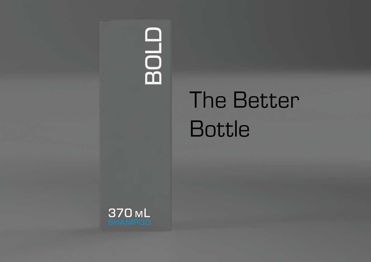
To submit to the RSA, we created four big-idea art boards and 10 supporting boards focusing on the creative process. I suggested the four main boards feature the bottle design, the brand design, a detailed breakdown of the monetary gain through supply chain efficiency and a board regarding Bold’s interplay with the circular economy. I also suggested the idea of having the boards ‘stack’ onto one another to represent two large rectangular Bold bottles coming together (please see the detailed ‘artist statement’ supporting board for more information on this).
I championed the writing of the four boards and performed the analysis required to assess Bold’s impact on the supply chain from storage to the shelf.
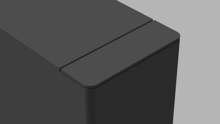
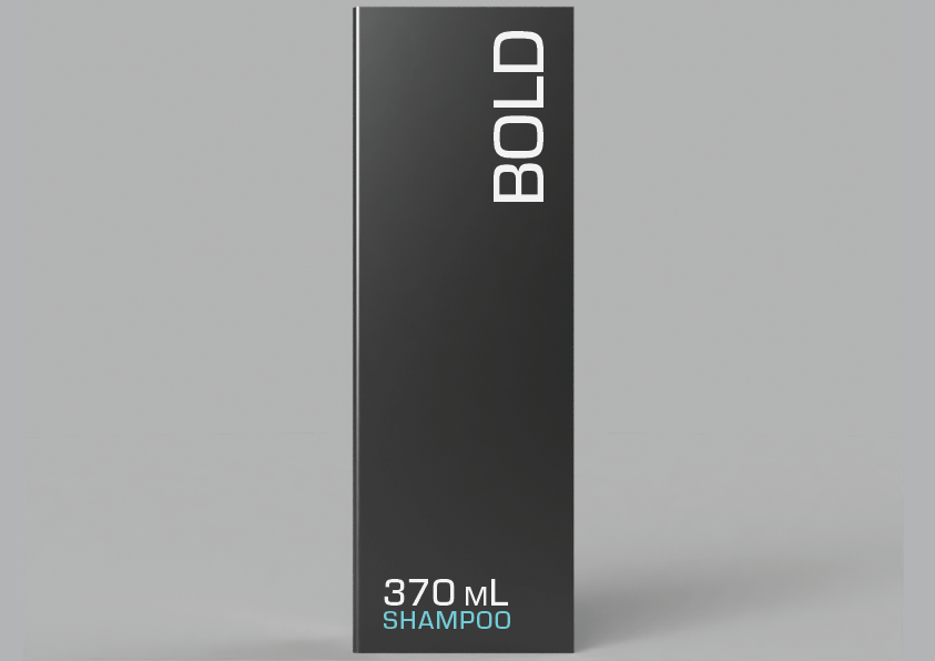
The Hero Image
Another part of our submission was the hero image. To create this, I developed a simple 3D model in Fusion 360 and created a series of renders in various environments. These renders were later edited in Illustrator to bring in additional detail. Below are a few of the render samples and our final hero image.


Contributions
I created a small document outlining my individual contributions in more detail than I have presented here. If you would like to read more about my work on the project, you can read that here.